Still life painting transforms everyday objects into compelling artistic narratives through masterful technique and careful observation.
Understanding Still Life Painting Fundamentals
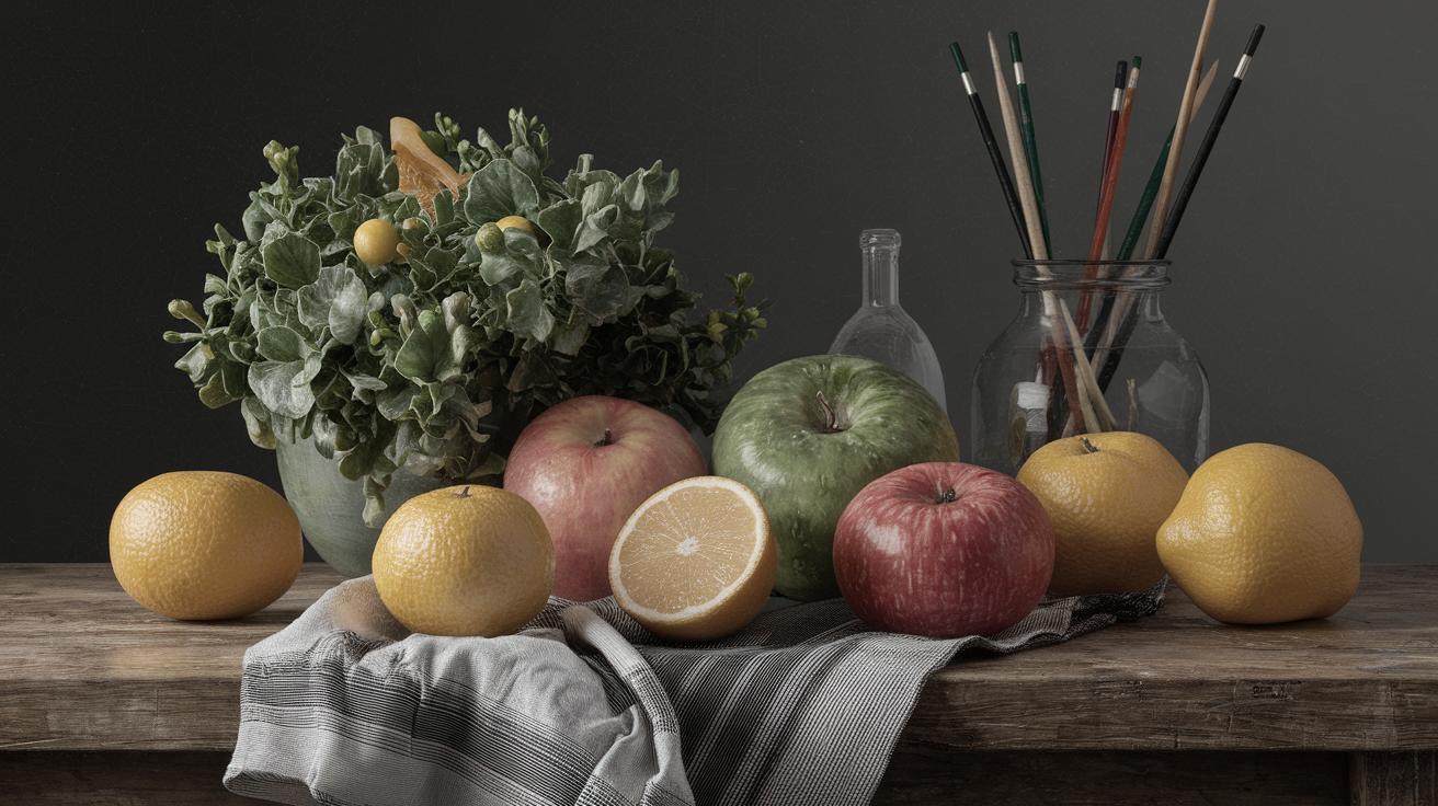
Still life painting, a genre deeply rooted in art history, offers a timeless exploration of form, shadow, and light. This comprehensive guide delves into the intricacies of realistic still life painting, covering essential techniques from preliminary sketches to finished masterpieces. Whether you’re working with oil paints, acrylics, or watercolors, these foundational principles will elevate your artistic practice.
Modern still life artists combine traditional methods with contemporary approaches, creating works that capture both photorealistic detail and expressive interpretation. The genre encompasses everything from classical fruit arrangements to modern conceptual compositions, offering endless possibilities for creative exploration.
Essential Materials and Setup for Still Life Success
Choosing Your Medium and Supplies
Professional still life painters typically work with high-quality pigments and archival materials to ensure longevity. Oil paints remain popular for their blendability and extended working time, while acrylics offer quick drying and easy cleanup. Watercolors provide luminous transparency ideal for delicate subjects like flowers and glass objects.
Your brush selection significantly impacts texture and detail quality. Natural bristle brushes work excellently for oil painting, while synthetic brushes perform better with acrylics and watercolors. Include various sizes from fine detail brushes to broad wash brushes for maximum versatility.
Setting Up Your Still Life Composition
Successful still life arrangements begin with thoughtful object selection and strategic lighting placement. Choose objects with varying textures, sizes, and reflective properties to create visual interest. Combine matte surfaces with glossy ones, rough textures with smooth ones, and organic shapes with geometric forms.
Directional lighting creates dramatic shadows and highlights that define form and volume. Position your light source at a 45-degree angle to your subject for optimal three-dimensional modeling. Avoid multiple light sources initially, as they can create confusing shadow patterns.
Thoughts On Painting
10-Minute Thumbnail Sketch Challenge: Birds
The 10-minute thumbnail sketch challenge is an invigorating exercise for artists of all skill levels. This quick, focused drilling helps in honing observational skills and understanding avian anatomy. By capturing the essence of birds in a mere ten minutes, artists can sharpen their ability to see the larger shapes and forms that define a subject, rather than getting lost in minute details.
Through this challenge, painters can learn to let go of the perfectionist tendencies that often inhibit creative progress. Instead, the focus shifts to letting the hand flow freely, capturing the life of the subject with instinct and intuition. Such exercises condition artists to trust their instincts and work efficiently, a skill that is transferable to larger, more detailed projects.
A Floral Spotlight: Each Iris Has Its Own Personality
In still life painting, flowers present a unique challenge and opportunity for expression. Every iris, for instance, is a story unto itself, with its unique curves, colors, and character. Painting irises calls for an understanding of the subtlety and depth inherent in each petal, requiring patience and attention to detail.
To capture the personality of an iris, one must look beyond its physical appearance. The way light plays through its petals, on a bright morning or during a moody sunset, transforms its appearance, allowing an artist to convey different moods and emotions. By immersing oneself in this detailed observation, the painter creates a more vibrant and authentic depiction that resonates with viewers.
Starting a Painting with Design and Values
The foundation of any successful painting lies in strong design and an understanding of values. Before translating a vision onto canvas, it’s critical to plan the composition carefully. Deciding on the placement of objects, the focal points, and the path of the viewer’s eye are central to engaging and sustaining interest.
Values, the lightness or darkness of a color, are equally crucial. Understanding and applying values correctly can make or break the illusion of three-dimensionality. A well-composed painting uses values to draw attention where necessary and create a sense of depth, guiding the viewer through the narrative the artist envisions.
Indicate, Don’t Illustrate
The adage “indicate, don’t illustrate” is a profound guide in the arts of painting. This principle encourages artists to suggest rather than define, allowing viewers to engage their imagination when interpreting a piece. In still life, this approach can be a subtle yet powerful tool to evoke emotions and memories.
Rather than focusing on meticulously detailing every aspect, painters are encouraged to consider what to leave out. The strategic omission of certain details can create an aura of mystery and intrigue, prompting viewers to fill in the gaps themselves, thus participating in the creative process.
Advanced Color Theory for Still Life Painting
Understanding Color Temperature and Harmony
Color temperature plays a crucial role in creating realistic still life paintings. Warm colors (reds, oranges, yellows) advance toward the viewer, while cool colors (blues, greens, purples) recede into the background. This principle helps establish spatial relationships and atmospheric perspective in your compositions.
Successful color harmony relies on understanding complementary relationships and analogous schemes. Complementary colors create vibrant contrasts when placed adjacent to each other, while analogous colors provide subtle, pleasing transitions that unify your composition.
Mixing Realistic Flesh Tones and Natural Colors
Creating believable colors requires understanding color bias and chromatic mixing principles. Every pigment has a temperature bias that affects mixing results. For example, cadmium red light (warm) mixed with ultramarine blue (cool) creates different purples than alizarin crimson (cool) mixed with cerulean blue (warm).
Natural objects rarely display pure, saturated colors. Most surfaces reflect ambient light and surrounding colors, creating subtle color variations that make paintings appear more realistic. Observe how white objects pick up reflected colors from nearby surfaces.
Watercolor Still Life Paintings by Laurin McCracken
10-Minute Thumbnail Sketch Challenge: Birds
Laurin McCracken, a master of watercolor still life painting, often advocates for preliminary sketching as the backbone of successful works. His involvement in 10-minute thumbnail sketch challenges focuses on birds, allowing him to refine his understanding of these creatures’ forms and movements. These sketches serve as a foundational practice that fuels McCracken’s complex and nuanced watercolor compositions.
The brevity of these sketches forces McCracken to distill birds into their essential shapes and postures, capturing their essence with the simplicity of line and wash. This preparatory work is invaluable in larger projects, where these insights gained from sketching translate into more dynamic and life-like representations.
A Floral Spotlight: Each Iris Has Its Own Personality
In McCracken’s work, flowers, particularly irises, are more than mere subjects; they are characters radiating individuality. His approach to portraying each iris’s unique personality stems from an acute observation and appreciation of the subtleties in coloration and form. McCracken’s irises are a testament to the marriage of precision and expressiveness that characterizes his work.
In watercolor, where control over the medium must be balanced with letting it act naturally, capturing the essence of irises requires a fluid yet deliberate technique. McCracken’s florals show how attentive application of water and pigment can visually translate the vibrancy and delicate beauty of flowers, each petal in his compositions bursting with life and detail.
Starting a Painting with Design and Values
Laurin McCracken places immense importance on the roles of design and values in the success of his watercolor paintings. His compelling compositions are the result of intentional planning, where every object’s placement within the frame is carefully considered to maximize narrative and visual harmony. By doing so, he ensures each piece is not only a representation of reality but a crafted experience for the viewer.
His mastery of values is evident in his ability to create depth and luminosity in watercolors. McCracken’s nuanced understanding allows him to wield contrast and gradation to create striking chiaroscuro effects, an approach that renders his paintings life-like and enriched with a sense of realism that invites closer inspection.
Painting of the Week: “Old Copper and Fruit”
“Old Copper and Fruit” exemplifies Laurin McCracken’s refined skill in watercolors. This work captures the interplay of rough metal surfaces with the smoothness of fruit skin, showcasing his deft ability to handle textures and materials. The painting is a study in contrasts, where light dances across varied surfaces, bringing the composition to life.
In this painting, McCracken’s adept use of color and value is evident. The rich tones of the copper contrast with the vibrant hues of the fruit, demonstrating his eye for detail and composition. This piece not only reflects McCracken’s technical prowess but also his ability to imbue everyday objects with elegance and significance, elevating them beyond their mundane origins.
Professional Techniques for Realistic Rendering
Mastering Light and Shadow Relationships
Understanding light behavior is fundamental to creating convincing still life paintings. Light follows predictable patterns: direct light creates the brightest highlights, while reflected light bounces into shadow areas, preventing them from appearing completely black. The transition between light and shadow, called the terminator, defines the form’s three-dimensional quality.
Cast shadows anchor objects to their surfaces and provide crucial spatial information. These shadows are typically darker and more defined near the object, becoming lighter and softer as they extend away. Understanding this shadow gradation helps create believable spatial relationships in your compositions.
Texture Rendering Techniques
Different materials require specific approaches to achieve realistic textures. Metallic surfaces reflect their surroundings with sharp, defined reflections, while matte surfaces absorb light and show subtle value gradations. Glass objects combine transparency with reflective properties, requiring careful observation of how light passes through and bounces off their surfaces.
Fabric textures depend on weave patterns and material properties. Silk appears smooth with soft highlights, while canvas shows distinct weave patterns that catch and hold light differently. Practice rendering various textures through controlled brushwork and strategic color placement.
Common Still Life Painting Mistakes and Solutions
Avoiding Overworking and Maintaining Freshness
One of the most common mistakes in still life painting is overworking areas that were initially successful. Fresh, confident brushstrokes often capture the essence of a subject better than labored, overworked passages. Learn to recognize when an area is complete and resist the urge to continue refining beyond necessity.
Color mixing on the canvas can create muddy, lifeless passages. Instead, mix colors thoroughly on your palette before application, and use clean brushes for each color mixture. This approach maintains color purity and prevents unwanted color contamination.
Proportion and Perspective Accuracy
Accurate proportional relationships are crucial for believable still life paintings. Use measuring techniques such as sight-sizing or comparative measurement to ensure objects relate correctly to each other. A small error in proportion can make an otherwise skillful painting appear amateurish.
Ellipse construction challenges many artists when painting circular objects like bowls, plates, or vases. Remember that circles appear as ellipses when viewed at angles, and these ellipses become more pronounced as the viewing angle increases. Practice drawing accurate ellipses to improve your still life accuracy.
Building Your Still Life Portfolio
Developing a Personal Style and Voice
While technical proficiency is essential, developing a personal artistic voice distinguishes your work from others. Study master painters to understand their approaches, but avoid copying their styles directly. Instead, incorporate elements that resonate with your artistic vision while maintaining your unique perspective.
Consistent subject matter or recurring themes can help establish your artistic identity. Some artists focus on specific objects like flowers, food, or antique items, while others explore particular lighting conditions or color palettes. Find subjects that genuinely interest you and explore them deeply.
Documenting Your Artistic Progress
Maintaining a visual journal of your artistic development helps identify areas for improvement and tracks your progress over time. Photograph your paintings in consistent lighting conditions and keep notes about techniques used, challenges encountered, and lessons learned from each piece.
Regular self-assessment and constructive criticism from other artists accelerate your development. Join local art groups or online communities where you can share work and receive feedback. Be open to suggestions while maintaining confidence in your artistic vision.
Summary of Main Points
| Aspect of Art | Key Insights |
|---|---|
| 10-Minute Thumbnail Sketch Challenge | Enhances quick observational skills, focusing on essentials over details. |
| A Floral Spotlight: Irises | Portraying flowers with individuality requires attention to form and light. |
| Design and Values | Crucial for composition, guiding the viewer’s eye and creating depth. |
| Indicate, Don’t Illustrate | Encourages viewer engagement by allowing interpretation rather than over-definition. |
| Laurin McCracken’s Approach | Focuses on precision, expressiveness, and elevates everyday subjects through technique. |
| Color Theory Application | Understanding temperature and harmony creates realistic and compelling compositions. |
| Light and Shadow Mastery | Proper light behavior knowledge ensures three-dimensional form representation. |
| Texture Rendering | Different materials require specific techniques for authentic surface representation. |